1. Printing small, light text on top of a darker background might not work that well. Depending on the printer the darker color will bleed onto the lighter text.
2. How to better use color to show visual hierarchy and emphasis.
3. I didn't know about type classifications before. Before I only knew about serif and sans serif, not about modern or transitional text.
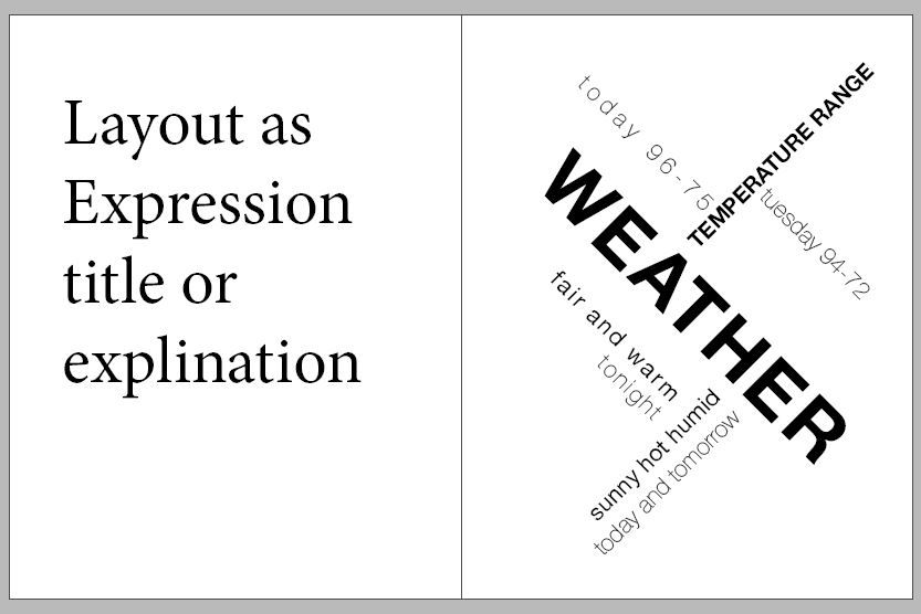
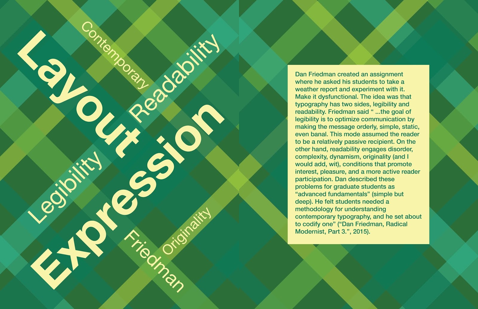
4. I learned how to use layout as expression. I used this on my cover and title pages.
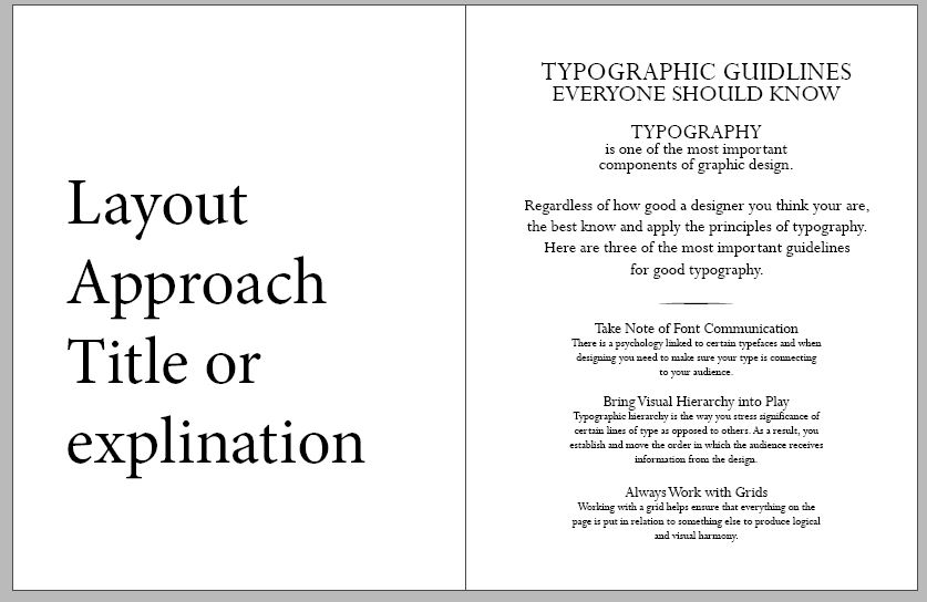
5. I learned how to better utilize grids and margins. Also how to use a grid to my advantage when laying out my book.
-------------------------------------------------------------------------------------------------------------------
Five Things I Should've Learned About Type
1. How to be more creative with type.
2. Don't need to have complex patterns or crazy colors to make it look good.
3. Using bold or color to add emphasis. Don't need a bright color to draw the viewer's attention.
4. Don't need to use huge font sizes. 12 pt size font will come up just fine on a page.
5. How to fully utilize a type system besides having the same colors and font sizes.
List of student's books I looked at:
- Kyler
- Sammi
- Breana
- Delaney
- Baylee